Now, you have to bear in mind that this will not be how the finished book looks. In fact, it probably won't even be how the finished book reads. I'm sure I'll edit and re-write my bits before it gets published. This is purely for a bit of fun, and to give people some small insight into my thinking.
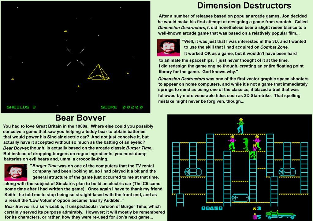
One of my ideas is to have a small picture of each person and put it next to their quotes. You can see how that might work on this page. What I thought I might try and do is to get a picture from each person, and then try and make it look like a C64 or Spectrum image, depending on their platform of choice. It would be a little bit like the classic computer magazine "box-out" comments, but with a little graphical twist.
 |
| If you haven't got a magnifying glass to hand, click here for a bigger view. |
So anyway, that's been my Saturday. It's made an interesting change to just putting words on a page, although I don't yet know how useful it will prove to be. The finished product will look a lot more professional than that, and possibly a lot different. But it's a starting point, and proof that I'm actually doing something. Anyone got any comments?
I'd consider treating the layout as vertical columns rather than horizontal rows, so have the Dimension Destructors text immediately below the image rather than across from it, I think that will read more naturally. Depending on how wide the pages are going to be, you might also want to look at splitting the text up into two columns too. I think it's maybe just verging on being too long for a single column, so worth trying splitting it to see how it reads.
ReplyDeleteI agree with Ben - I automatically linked game with text vertically and thought, hang on a sec. I'd also align the text to be the same width as your image in this case giving more white space around the columns and giving it a better flow (design wise). Happy to assist with suggestions on that kind of stuff at any time Paul though I have no formal quals in that area (disclaimer... :) )
ReplyDeleteI can see why you would make the vertical links to text and pictures, now that I look at it. This is just playing, though, so I have no doubt there will be many changes to look and design before the end. I certainly hope so.... that jpeg doesn't really look that great! I certainly appreciate any comments, anything that helps to shape this book for the better is great as far as I'm concerned. I doubt I'll have it set out so that all the pages look the same, in the end... some games will have a double-page spread, for instance...
ReplyDelete